Design Case Study
Nutrition Tracker: Zero-Friction Calorie & Macro Logging
Company
Personal Project
Role
Product Designer & Developer
Expertise
Product Designer & Backend Developer
Year
2026
Project description
Tracki is a nutrition tracker built to make calorie and macro logging feel effortless — AI capture on the front, a structured Java backend underneath, and a visual dashboard for end-of-day review.
Timeline
Started as a Telegram + n8n experiment, then a January 2026 commitment to learn Java and ship a custom backend, dashboard, AI onboarding, conversational logging, and intake analytics.
Background
No-code tools proved AI meal capture could be fast, but data stayed trapped in a linear chat stream — no structured database, trends, goals, or visual command center. Building the real product required a proper persistence layer and UX architecture.
Process
From a no-code MVP wall to a live product: research through engineering pivot, usability testing, AI onboarding, conversational input, analytics, and favorites.
Spark & Engineering Pivot
Validated AI capture via Telegram + n8n, hit no-code limits, learned Java backend architecture, and connected the first Figma dashboard to a live API.
Usability Testing V1
Put the live dashboard in front of users — confirmed the backend, exposed temporal confusion and visual noise, and scoped a full V2 redesign.
AI Onboarding & Chat Logging
Solved the zero-goal cold start with a confirm-first AI wizard, then replaced multi-field meal forms with natural-language Meal Draft Cards.
Analytics & Favorites
Structured weekly/monthly macro channels for scannable trends, then shipped a Favorites bar above the omnibar — and redesigned it after usability feedback.
The Spark: Why No-Code Limits Led Me to Learn Java
My journey started with a simple experiment: I built a quick MVP using a Telegram bot connected via n8n to generative AI models. The input was lightning fast—snapping a meal photo or typing a quick message took under 10 seconds. But I immediately hit a wall with no-code tools: data lived trapped in a linear chat stream with no structured database, no historical trends, no goal tracking, and no visual dashboard.
I realized that to build the product I truly envisioned—a visual command center where users could review daily nutrition statistics, create, edit, save, and delete meals at the end of the day—no-code wouldn't cut it. In January 2026, I made a decisive commitment: I sat down to study Java and backend architecture from scratch so I could build my own robust system.
With working Java foundations, when I had enough knowledge I was very excited—I thought, I'm ready for this. My approach was first to create a website to manage all the information—create, read, and update—so I went with the first mockup.
The Telegram + n8n experiment proved that AI capture worked, but no-code couldn't provide the structured data or visual dashboard I needed. Learning backend (Java) in January 2026 was the turning point that allowed me to bring my Figma designs to life with real persistence.
The n8n MVP Limit
Tested meal capture via Telegram and n8n. Fast input, but completely lacked structured persistence, historical trends, and UI dashboard capabilities.
The Engineering Pivot
Committed to learning Java backend architecture in January 2026 to build a reliable, custom database foundation for the app.
Figma to Live Prototype
Designed the primary end-of-day web dashboard in Figma and paired Antigravity and Gemini to connect it to the Java backend—design and backend myself, agents for the frontend.
First mockup
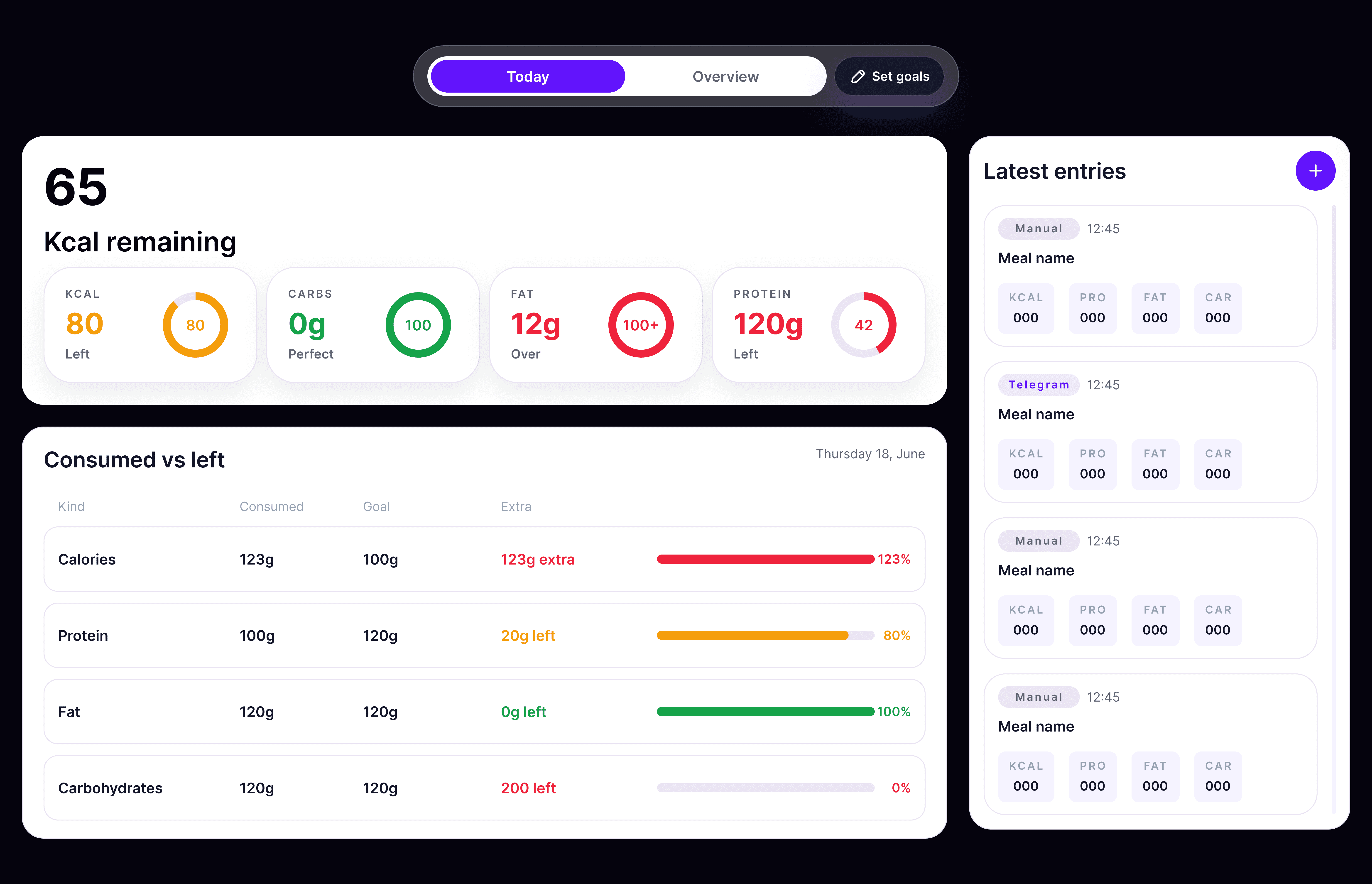
V1 end-of-day dashboard — the first Figma mockup connected to the Java backend.
Usability Testing V1: Uncovering What Failed
With Version 1 live and connected, I conducted user testing sessions and interviews. The custom Java backend performed smoothly, and users appreciated the core concept of an end-of-day dashboard. However, putting the interface in front of real people immediately revealed unexpected friction points.
First was visual: users felt the purple accent palette was generic and cluttered. But far more critical was a major UX flaw: temporal confusion. Users looked at the screen and hesitated: "Wait, am I looking at what I ate today or yesterday? In Latest Entries, are these meals from today or multiple days?" The boundaries of time were blurred.
This proved that the backend architecture worked, but the UI needed a complete philosophical redesign. It was time to build Version 2. The backend was solid, but users were lost in time — Version 1 taught me that simply displaying data isn't enough; the interface must establish unmistakable temporal boundaries and clean visual hierarchy.
Lost in Dates
Users couldn't distinguish today's meals from historical entries in the sidebar, causing cognitive friction during daily reviews.
Ditching Generic Purple
Replaced the generic purple theme with a refined Dual-Glassmorphism system (Obsidian Dark and Clean Light mode).
Java Backend Proven
Confirmed that the underlying Java REST API was fast and stable, giving me the green light to completely revamp the frontend UX.
V2: Overcoming the Zero-Goal Barrier with AI
Going into Version 2, I hit a massive product bottleneck: a user cannot simply create an account and land on an empty dashboard. Without daily calorie and macro goals, none of the progress rings, percentages, or deficit counters can compute anything.
I thought: "Okay, I'll make them set a goal upon registration." But how do you do that without massive friction? Most users have no idea how to calculate their BMR, TDEE, or ideal protein split. I'm not a doctor or a nutritionist, but I realized: what if an LLM calculates it for them?
Yet users often don't even know their exact targets. So I designed a frictionless 5-step onboarding wizard asking simple lifestyle questions (body metrics, daily activity, objective). The AI calculates the personalized numbers behind the scenes. Crucially, I followed a strict UX rule: always require human confirmation. If the user doesn't like the AI calculation, they can adjust it manually or pick simple preset templates. Zero lock-in, zero guesswork.
A dashboard without goals is useless, but asking users to do nutrition math causes drop-off. An AI wizard that calculates targets—while always giving the user final approval—solved the cold-start barrier.
Zero-Goal Barrier
Without established goals, analytics break. But demanding manual macro calculations during sign-up drives users away.
Simple 5-Step Questions
Asks intuitive lifestyle questions and uses an LLM prompt to estimate precise daily calories and macro splits.
Total User Autonomy
The AI proposes, but the user always approves. Manual overrides and preset templates ensure complete user freedom.
The Chat Breakthrough: Conversational Input as UI
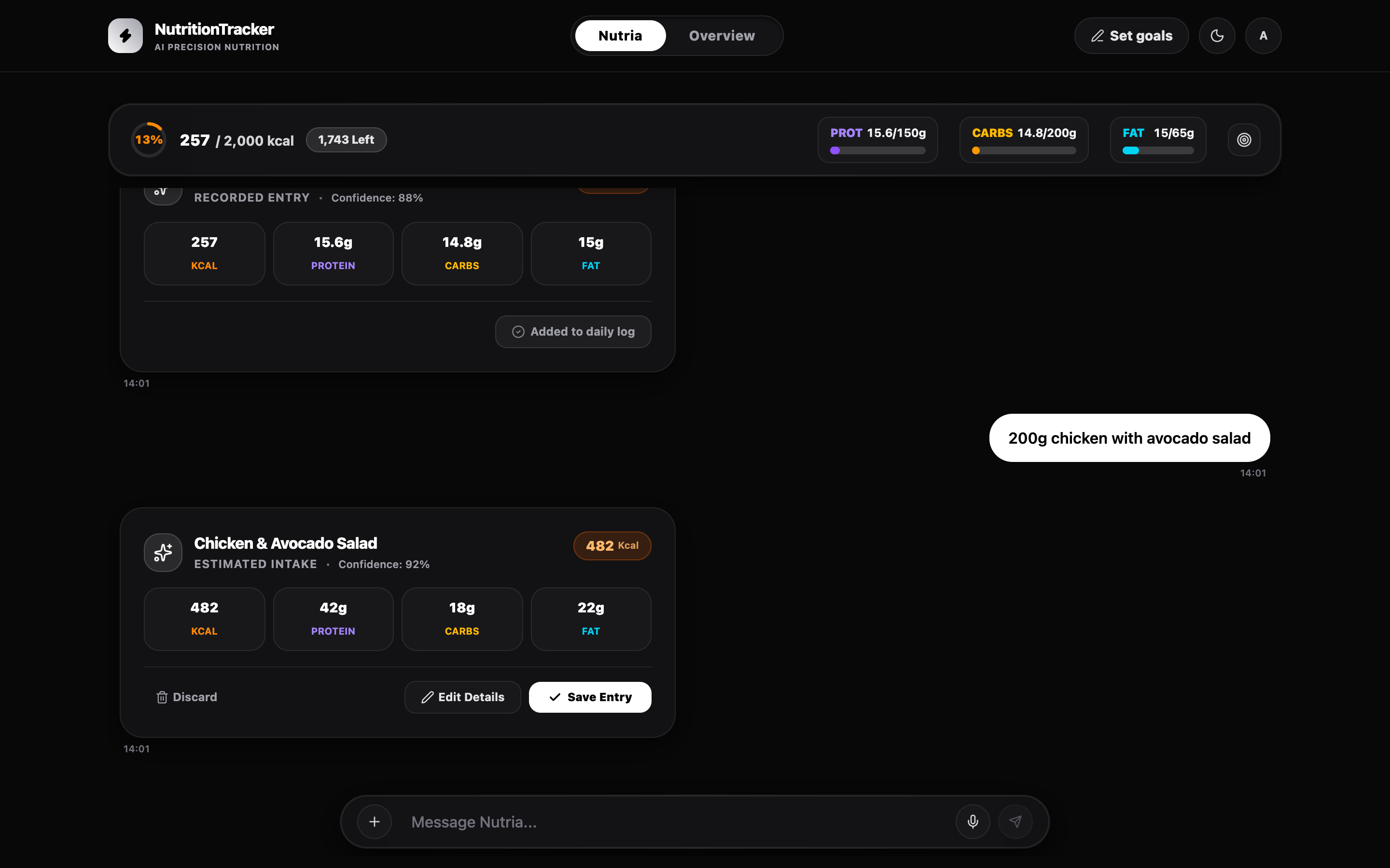
Once onboarding was solved, the user was finally inside the dashboard. But a major UX dilemma immediately surfaced: how do they log meals? In Version 1, logging required clicking "Add Meal" and manually typing names, grams, calories, proteins, carbs, and fats into rigid form fields.
I thought: "Why am I forcing users on desktop or mobile to do tedious data entry? If my original vision was to eliminate input friction, why punish web users with manual forms?" If someone is reviewing their day on the web and wants to log lunch, they should have the exact same AI speed as anywhere else.
That was when I remembered an insightful 2015 LinkedIn post that had stuck with me: "What happens if chat interfaces solve our problems and we forget about traditional UI forms? Could a chat completely replace an interface?" With modern LLMs, describing your problem in natural language is ten times faster than navigating forms. Bingo—that was the answer.
Instead of another complex form modal, I integrated an AI chat. But I established two strict UX rules: no conversational fluff—I wanted a direct, structured Meal Draft Card that looked identical to the dashboard entries (text in → visual card out)—and review-first safety: the AI must never save directly to the database. Users must always inspect, edit values inline, or delete before confirming.
Engineering this complex multi-state chat pushed frontend development to its limits. When Gemini Flash hit its ceiling with complex UI state lifecycles, I leveled up my workflow using Grok 4.6 and Claude Opus to successfully build the front-end chat interface. Why force users to fill out five form fields when they can type "200g chicken with avocado salad"? Natural language paired with actionable Meal Draft Cards kills input friction.
Form Dilemma
Replaced tedious multi-field manual forms with natural language logging (text and photo) directly inside the web dashboard.
Structured Draft Cards
The AI skips conversational filler and outputs an interactive Meal Draft Card matching the dashboard's visual design.
Human Verification
The AI never writes directly to the database; users must review, edit if needed, and confirm every single entry.
V2: Intake Analytics & Long-Term Trend Clarity
With effortless AI logging via chat and active goals established, the final UX challenge of Version 2 was data consumption: how do we make historical data scannable and meaningful over time?
Logging effortlessly is only half the battle; users need to understand their progress without deciphering complex tables. I spent substantial design time structuring the Intake Analytics dashboard. I split the time horizons into Weekly (to inspect day-to-day consistency) and Monthly (to identify broad caloric deficits or surpluses).
To prevent visual fatigue, I isolated each parameter—Protein, Carbs, Fat, and Calories—into dedicated channels with persistent color tokens. This allows a user to instantly spot if their protein intake dropped on weekends or if their calories were consistently on target. This module is currently live and actively evolving through continuous user feedback.
Effortless input means nothing if data consumption is exhausting. Structuring analytics into weekly and monthly macro channels turns raw numbers into instant health clarity.
Weekly vs Monthly
Toggle seamlessly between immediate 7-day consistency and high-level 30-day macro trends.
Isolated Macro Channels
Dedicated visual sections for Protein, Carbs, Fat, and Calories using persistent, high-contrast color tokens.
Designed for Iteration
A modular analytics layout built to adapt density and charts based on real-world user feedback.
Current Roadmap: Favorites Polish, Telegram Sync & Backend Story
Product design is a continuous loop of listening, refining, and building. Favorites is live and iterating from real usability feedback — clearer labeling, one-tap logging from Settings, and more testing still ahead.
Once Favorites feels solid, I will finalize the Telegram bot synchronization to complete the omnichannel ecosystem. And because this entire product was engineered from the database up, I wrote a dedicated Backend & Engineering deep-dive covering the Java Spring Boot, Spring AI, and PostgreSQL architecture behind the scenes.
Great products are built through relentless iteration. From learning Java in January to conversational AI cards and one-tap favorites, every decision is driven by cutting friction.
One-Tap Favorites
Quick-access bar above the omnibar for recurring meals — redesigned after users mistook "Add" for logging a new meal.
Omnichannel Sync
Connecting the conversational AI logic to Telegram so mobile logs instantly reflect on the web dashboard.
The Engineering Page
Companion write-up on the Spring Boot REST API, Spring AI prompts, and database architecture — now live.
Favorites: Above the Omnibar, Learned from Feedback
After chat logging and analytics were solid, the next friction to cut was re-logging staples — morning coffee, the same lunch, the daily protein shake. I added a Favorites bar directly above the omnibar so users could log a preset without leaving the Nutria conversation surface.
The first attempt put a meal-type selector (Lunch, Dinner, and so on) next to a dashed button that simply said "Add." The idea was right — users appreciated having favorites nearby — but nearly everyone assumed "Add" meant log a new meal, not create a favorite. An empty bar with that button was especially confusing.
The redesign keeps the same bar and the meal-type selector (still scoped to favorites only), but adds a My Favorites title with a star icon above the controls, and renames the action to "Add Favorites." After shipping that, users immediately understood the bar was favorites-only. I still need more testing, but based on the feedback this is the version to validate next.
The same clarity problem showed up on the favorite affordance itself and in Settings. I added a short "Add to favorites" label so the star action reads as what it does. Settings had been meant only for edit and delete — but many people wanted to pick a meal there and have it log. That turned out to be a strong idea, so selection-to-log from Settings is now in as well.
First Attempt
Favorites bar above the omnibar with a meal-type selector and a generic "Add" button — users read it as "add a meal."
Clearer Labels
My Favorites title + star icon above the controls, "Add Favorites" CTA, and "Add to favorites" microcopy so the affordance explains itself.
Settings as Launch Pad
Originally edit/delete only; users asked to select a favorite and log it from there — now supported.
The Overview today
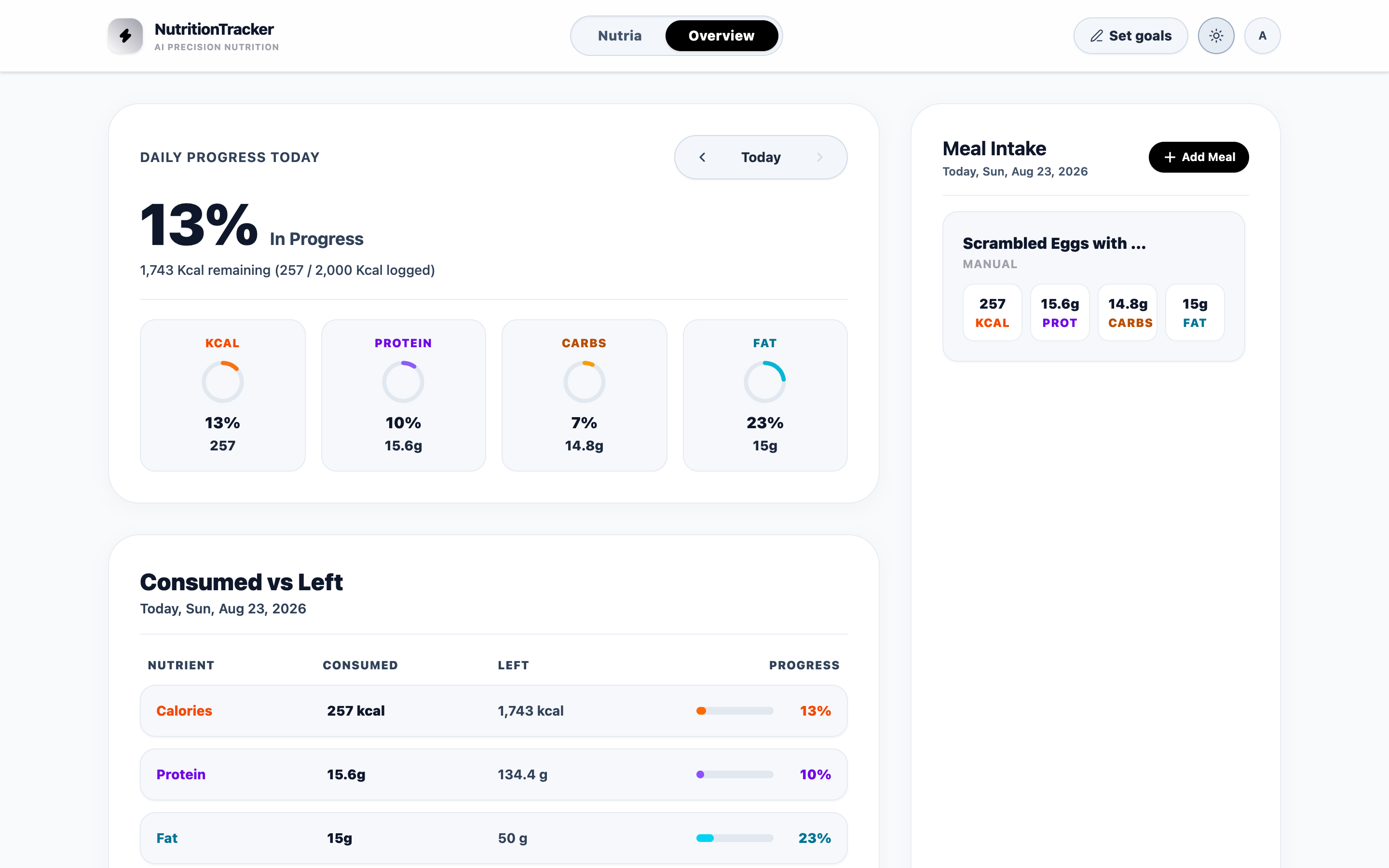
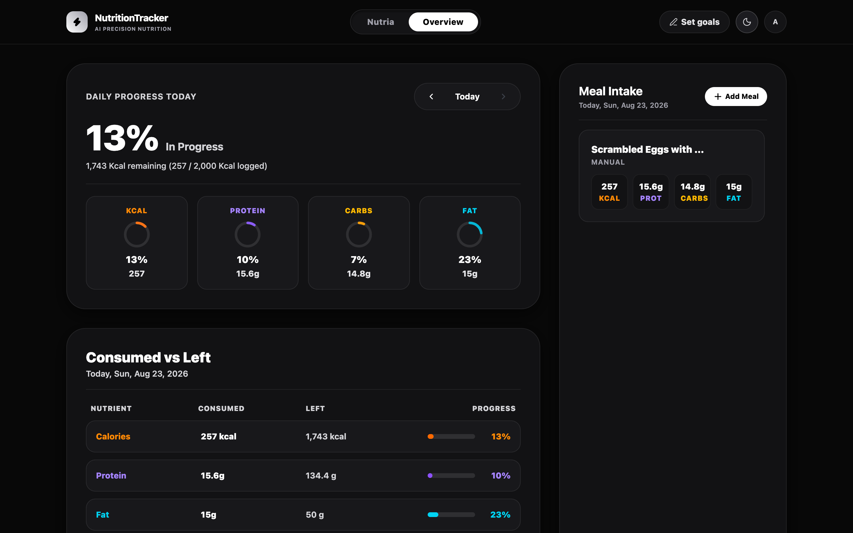
The end-of-day dashboard is the command center: today's progress, leftover macros, and logged meals — with a Dual-Glassmorphism system that switches between Clean Light and Obsidian Dark.
Still Open: Feedback I Need to Keep Testing
Shipping Favorites did not close the loop — it opened clearer questions. A few friction points from recent sessions are still on my plate before I treat the Nutria surface as settled.
Voice input is the sharpest one. When the mic opens and the user starts speaking, capture sometimes lags — enough to create false starts and dropped phrases. Showing the transcribed text before submit would also cut friction when an audio parse comes back wrong, so users can fix the wording instead of re-recording blind.
I still have doubts about Nutria's layout itself: keeping the omnibar narrower than the full screen width feels intentional, but I have not proven it is right. And Favorites above the chat is appreciated in early feedback — yet I still need to validate whether users truly want that bar there day to day, or whether it belongs somewhere else once habits settle.
Voice Capture Lag
Mic open, speak can be slow to latch; users lose the first words and distrust the flow.
Review Before Send
Let users see (and edit) transcribed text before submitting — less friction when audio parses poorly.
Layout & Placement Doubts
Omnibar narrower than the viewport is still unproven; Favorites above Nutria needs more testing on whether it belongs there.
Conclusion
Tracki began as a Telegram + n8n experiment that proved AI meal capture could be fast—and immediately showed why no-code couldn't carry a real product. Learning Java gave me the persistence layer and API foundation to turn Figma into a live dashboard.
Usability testing on V1 exposed temporal confusion and visual noise; V2 answered with clearer time boundaries, an AI-assisted goal wizard that never removes user control, conversational logging via Meal Draft Cards, and analytics split into weekly and monthly macro channels.
Favorites followed the same loop: ship a one-tap bar above the omnibar, listen when "Add" read as meal logging, and redesign labels until the surface is unmistakably favorites-only. Voice review-before-send, omnibar width, Favorites placement, and Telegram sync are the next bets to validate — same north star: make calorie and macro tracking feel effortless without sacrificing accuracy or trust.