Design Case Study
High End speakers E-comerce
Company
Phantom Acoustic
Role
Product Designer
Expertise
UI Design & Research
Year
2025
Project description
I was contracted to design the UI of an e-commerce website, applying my UX expertise to ensure a seamless user experience. The client sought a professional, modern design inspired by Apple's product presentation style. The design is currently nearing completion, and I will personally develop the website in WordPress with WooCommerce.
Timeline
The project started in February alongside the initial production phase of the speakers. This abstract yet essential work ensures that by the time the product is ready, the e-commerce platform will be fully functional. The expected product release is by the end of April, aligning both the website and product development.
Background
This project intrigued me because I had never built such a complex e-commerce site where the website and product evolved simultaneously. Working closely with the CEO of Phantom Acoustics, we created a flowchart to guide the development. Given the product's disruptive nature, the client extended my contract so that I could personally handle the WooCommerce integration.
Process
This category details the step-by-step approach taken during the project, including research, planning, design, testing, and optimization phases.
Research & Meetings
I spent around three weeks at Phantom Acoustics' early-stage facilities to fully understand the product, its market value, and the quality standards it aimed to reflect. During this time, I collaborated with the CEO to refine the flowchart, identifying the need to focus on product explanation, collections, and customer benefits rather than direct selling.
Prototyping
Once I had a solid understanding, I moved to Figma to conceptualize ideas, selecting colors and typography that aligned with the brand. This led to smooth communication with the CEO, who approved the prototypes with enthusiasm.
Content Refinement
The CEO initially wanted extensive text on the homepage, which posed UX challenges. To improve readability and engagement, I reorganized the content into structured sections with supporting images or videos, along with "Learn More" buttons to maintain a clean design while still conveying all necessary information.
Iteration & Feasibility Testing
As I worked in Figma, I simultaneously tested feasibility in WordPress. A major challenge arose with WooCommerce's automatic product import system, which limited my ability to design custom collection containers or add dual-action buttons. Given the low product launch frequency (2-3 per year), the CEO agreed to proceed with Elementor for full design customization.
Finalizing the Design
Since the product images were AI-generated at this stage, I documented the required replacements for actual photos and videos. This will allow the client to update the visuals independently when needed.
Update 10/2025
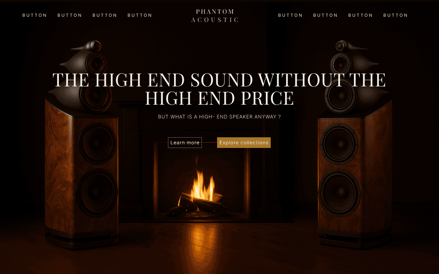
Our first idea for the Phantom Acoustic homepage featured a dark background with golden accents and a formal serif typography, inspired by luxury brands. We placed the navigation bar centered at the top, with side buttons and a strong hero image showing our speakers in front of a fireplace.
User Insight
During early mockups and tests, we realized that the dark background made visibility difficult and the hero image drew all attention to the fire, while users barely read the title. The layout looked premium, but it didn't communicate our value proposition clearly — "high-end sound without the high-end price."
Take aways
Even though this was only a mockup, it helped us understand that we needed to brighten the layout, rebalance focus, and create hierarchy around the message rather than the image. From here, we started experimenting with lighter tones, subtle gradients, and improved contrast for the text.
Before & after
Home page
Redesign
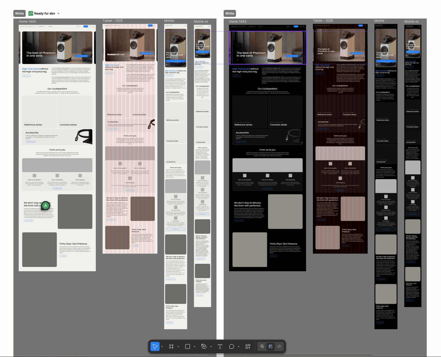
The initial version of the Phantom Acoustic homepage aimed to evoke a luxurious feel — we used a dark background, golden accents, and formal typography to match the brand's high-end positioning. However, user tests revealed that the visual hierarchy wasn't effective: the fireplace background attracted all the attention, while the title and message were overlooked.
This feedback guided us to rethink both the layout and emotional impact of the hero section.
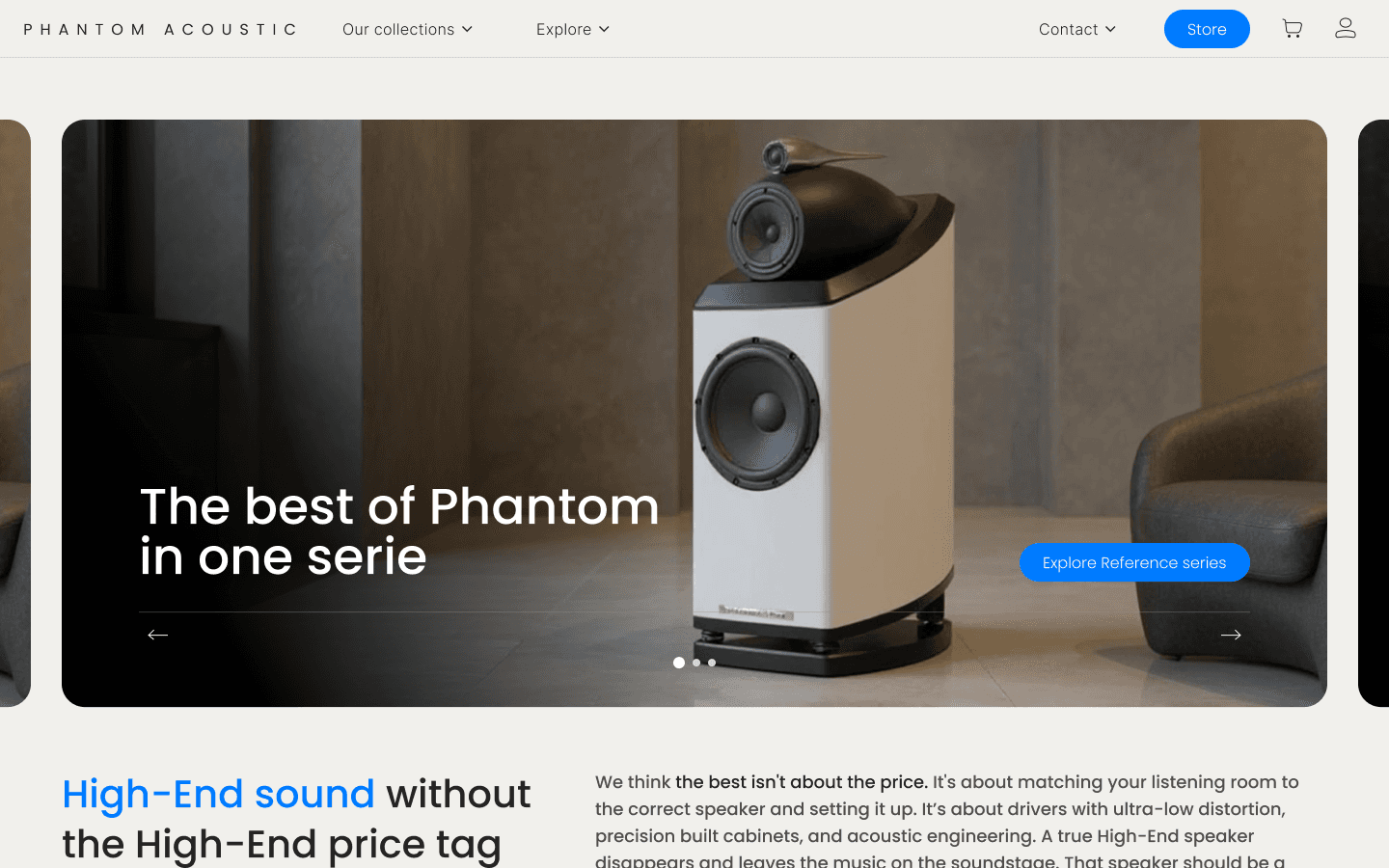
Transition to a Carousel
We replaced the static hero image with a carousel that allowed us to display multiple product shots. Since Phantom speakers are design objects meant to be seen as much as heard, this approach helped us communicate the product's craftsmanship and physical presence more effectively.
A Calmer, More Balanced Background
We introduced a lighter, neutral background that gives the content more breathing room. With this change, the speaker became the true focal point, while maintaining a modern and elegant tone.
User Feedback & Results
A survey with 10 users confirmed the success of the redesign — all participants preferred the new layout. They found it easier to read, more engaging, and more consistent with the brand's tone.
Design system
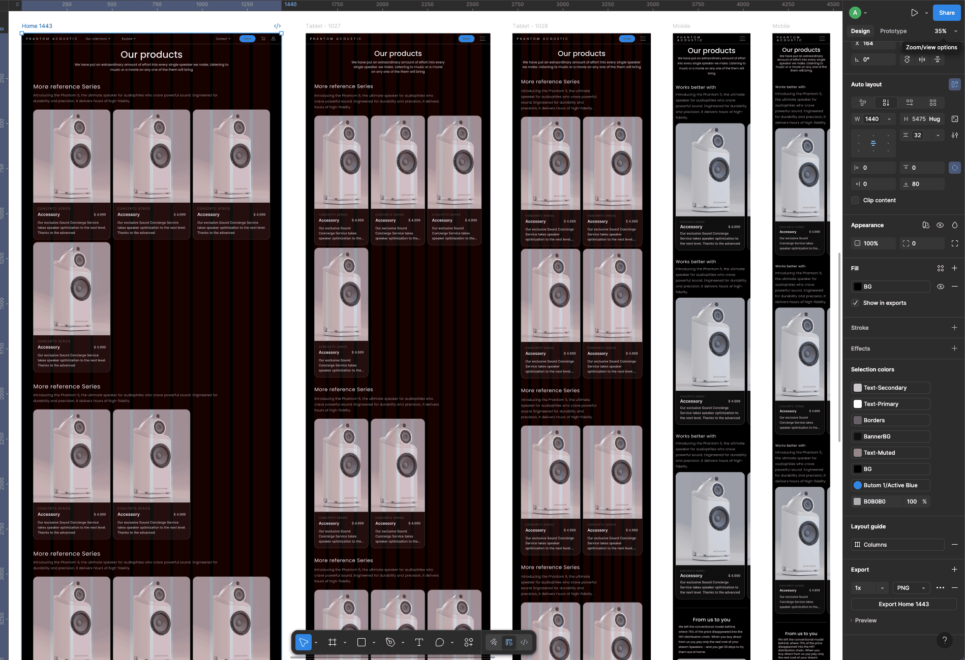
After defining the final direction for the homepage, we started building a scalable design system to ensure consistency across all future pages and devices. The goal was to create a structure that could easily adapt between dark and light modes, as well as between mobile, tablet, and desktop breakpoints.
These cards are intentionally minimal in interaction — they only allow direct clicks, without secondary actions such as "add to cart" or "favorites." Phantom Acoustic is not a traditional e-commerce, but rather a product experience platform where each click leads users deeper into the story behind every speaker.
Rethinking the Purchase Flow
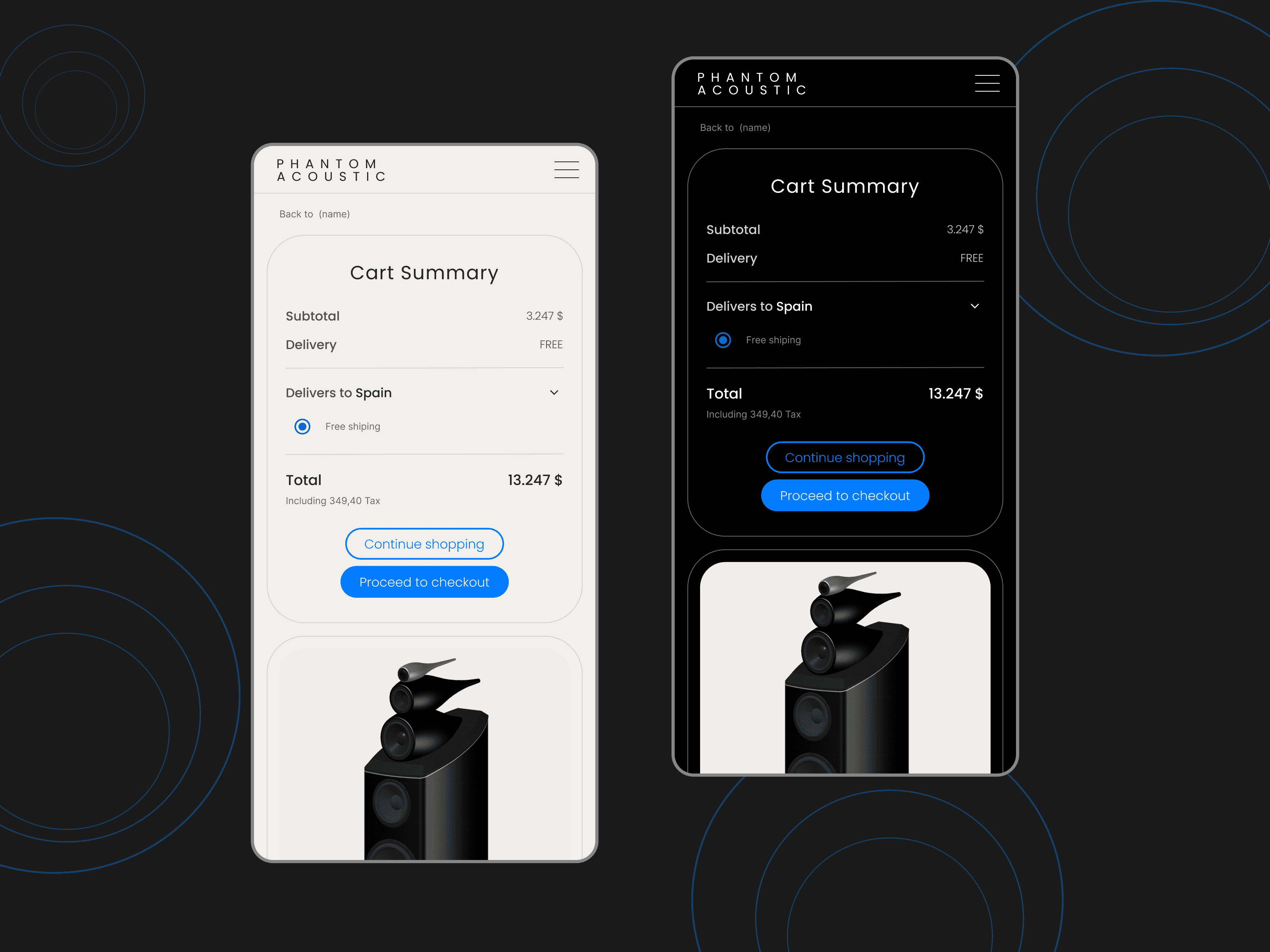
The absence of cart and favorite options was a conscious UX decision based on the brand's positioning and target audience. Phantom Acoustic speakers are premium, high-investment products, and potential buyers need to understand the story, the craft, and the technology before making a decision.
Product Explanation First
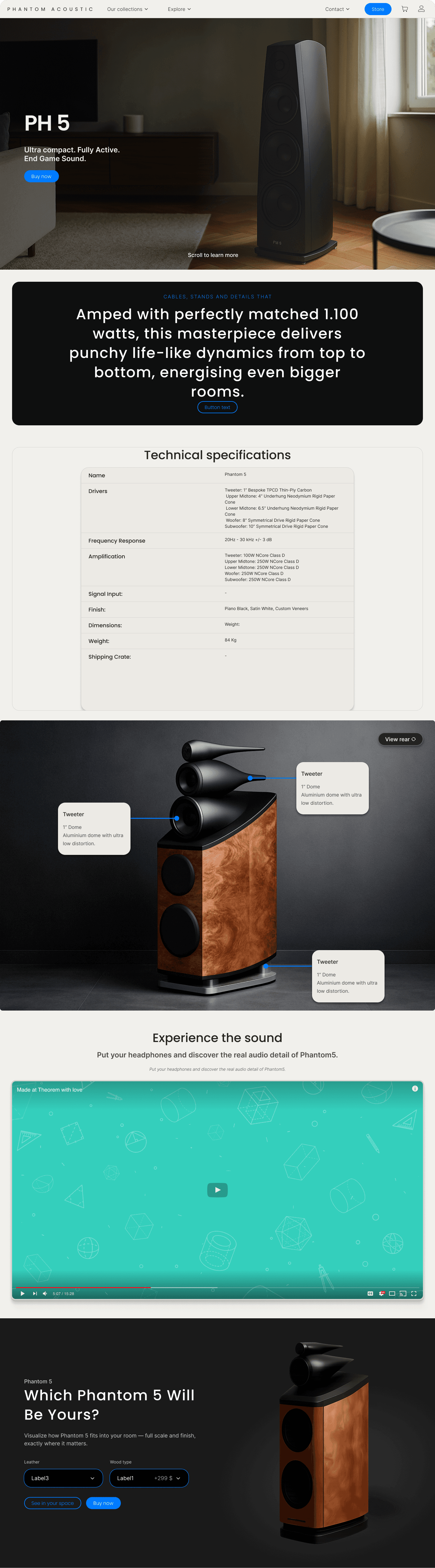
The flow was designed so that the first interaction leads users to a detailed Product Explanation page. Here, they discover the philosophy behind each model — its design, materials, acoustic performance, and customization options.
Visual over Technical
This structure ensures that the emphasis stays on the aesthetic and emotional impact of the product — not just its specs. By separating explanation from purchase, we created a journey that mirrors a luxury buying experience.
Conclusion
Final screens and key pages from the Phantom Acoustic platform.